Highlighted Collections...
Saturday, May 16, 2015
Ask more Questions....
While at GAFE Summit North Island this year, I went to one of +Holly Clark's sessions, "The Right Question".
She recommended the two books illustrated here, A More Beautiful Question and Make Just One Change. I have recently received these from The Book Depository and have made a start on A More Beautiful Question.
I am only into the first chapter so far, but it is already inspiring me to make changes to the Year 10 project that will start with their new Technology rotation in a week's time.
The main focus of the book so far has been to wonder why jobs, businesses, companies etc do not encourage more questioning from their employees and what type of questions lead to change. It is talking about changes in the brain and thought processes that occurs when a problem is approached by a series of questions, instead of any other way.
So how am I going to use this in an immediate way?
At the start of a project, we break down the process into a series of tasks. How would it affect the students if they used questions instead of statements?
The best questions to use are not ones that give yes / no / simple answers.
How can we....?
Why does this ... ?
What happens if ...... ?
Asking the right questions gets more depth of understanding.
For example :-
What colour is a stop sign? - this gives a really simple, one word answer.
Why is a stop sign red and what affect does this colour have on the observer? - this gives a much more thorough understanding of colour theory and how it is used in design work.
I want them to come up with questions that will lead to experimenting, trying things out, modelling, analysing in order to get the answers.
Much as I love Google, I don't want them to come up with questions that they can answer with a quick Google search.
Starting small and getting them to ask questions that they can work towards answering themselves is my plan to get them ready to start answering their questions with creativity and design work, which is a more difficult thing to ask them to do.
Is knowledge obsolete? It is so easy to get hold of any information at all.
It is the questioning of this information that is rising in importance.
The Watson Computer.
We can only get what we need out of tools like this by asking the right questions.
Friday, May 15, 2015
Going Live...
I have spent a lot of time trying to get the layout and content ready for the first project in both the Level 1 and Level 2 DVC courses to go live as a mooc style course. They need to have enough information, content and support so that they can be done by students outside of the classroom.
Level 1
Clicking this picture will take you to the Level 2 project.
I have offered this up to one student so far, as I knew he was interested in taking Level 2 DVC this year, but was unable to because of his other option choices.
I have chatted with the Dean of Year 12 to see if there are other students who might be interested to target them specifically.
This is a nervous time of waiting now, to see if they take up the offer / chance of doing something different in a very different way.
Level 1
Clicking this picture will take you to the plan for the first Level 1 project.
I have just emailed it out to the whole of Year 10 to see if any of them want to get 4 credits at NCEA Level 1 while they are still in Year 10. This project gives 4 literacy credits too so it is a good deal for them and a good start.
I have also emailed it to the Year 11 students so they can have access to an extra 4 Level 1 credits if they want.
Level 2
I have offered this up to one student so far, as I knew he was interested in taking Level 2 DVC this year, but was unable to because of his other option choices.
I have chatted with the Dean of Year 12 to see if there are other students who might be interested to target them specifically.
This is a nervous time of waiting now, to see if they take up the offer / chance of doing something different in a very different way.
Thursday, May 7, 2015
Site Design - Template 8
This design has the page set up so that the layout is "left sidebar". Both the horizontal and the sidebar navigation is turned off.
A tall, slim Google Drawing is embedded on the left sidebar with the links to the group pages set up on the drawing. These links lead to site pages for each group.
The header was made on a drawing and downloaded as an image file so that it could be used in the header on the site.
The main, large area of the page on the home page is used by an embedded Google Map that shows the areas of the school that each group is in charge of keeping tidy.
Using the left sidebar option to put the navigation drawing in leaves the rest of the page available for content on the front page, as the whole thing is not taken up by navigation as in other examples in the series.
Link to the template here
Link to the files used on the template here
See the rest of the templates in the series here
Wednesday, May 6, 2015
Site Design - Template 7
This layout has the header still in place but all the navigation is turned off.
The image for the header was made in Google Draw, with the background of it left transparent and the writing white. When downloading, the png option was chosen as this keeps the transparency.
The background colour of both the site and the page was chosen to be the same in themes, colours and fonts, so an even colour is behind everything.
The main image is an embedded Google Drawing so the links on each option work. The background for this embedded drawing is transparent so when it is put into the site the colour of the site shows through.
Tuesday, May 5, 2015
Site Design - Template 6
This template design continues the theme of using a Google Drawing for the navigation. The front / home page is an embedded Google Drawing. I have removed the site title / header and both navigation bars so this is all reliant on the Google Drawing.
Each of the coloured bars acts as a link to a page on the site. This had to be done on the drawing itself, so the links could be placed on the coloured shapes. I made the pages on the site and took each page url to be the link on the drawing.
The coloured bars theme is continued on each page with the headers...
The titles of each page have been removed on the page settings so these title bars are right at the top of each page and match with the coloured theme.
I have not put a home button on the individual pages as they open in different windows when clicked on the main page, so the home page is left open.
Here is the link to the template.
Here is the link to the file of documents used on the design.
Here are the rest of the site templates in the series.
There is a How To about making shapes into links on Google Drawing here
(If you use the Google Drawing from the design, the design includes a white circle to make part of the curved shape on the front. When it is embedded, only the part that overlaps the page on the drawing is included.)
Monday, May 4, 2015
Site Design - Template 5
The main focus of this template is the embedded Google Drawing. This drawing has a picture on it that has areas made into hyper-links to websites. When you click on the individual areas (planets, in this case), you are taken to different websites.
All the navigation has been removed and the main elements are the 5 round buttons at the top. These could take you to documents with the work for individual tasks or they could take you to more pages on the same website. ( the example buttons here are not linked to anything ).
I have laid out these 5 buttons in a single row table that has 5 columns in it.
As I had made the site 1000px wide, I made each of the 5 columns on the table 200px. The colour of the border of the table was changed to white, so it is invisible against the white background, by changing the rgb colour number to 255,255,255.
I then made sure the button images that I placed in each of the table cells were set to 100%, as this means they fill 100% of the space they are given... ie the 200px you gave to the cell width.
All of the images were created on Google Drawings. The header and the buttons were downloaded from drawings as png files and uploaded to the site. The main image with the planets on it was embedded as a Google Drawing so the hyper links will work.
Friday, May 1, 2015
Site Design - Template 4
This is site design number 4.
The header is still on this design and is made on a Google Drawing. This was downloaded as an image file and put onto the site in the themes, colours and fonts section of mange site.
The horizontal navigation is on and it is set to links. The colour of the links have been changed to match the header. This was done in themes, colours and fonts on the manage site option.
The layout of the page is the choice with the left side bar, so this is where the round group buttons were put. These buttons were made on Google Drawing and downloaded as image files.
Link to the site template.
Link to the documents folder for this site.
See the rest of the template design series here.
The header is still on this design and is made on a Google Drawing. This was downloaded as an image file and put onto the site in the themes, colours and fonts section of mange site.
The horizontal navigation is on and it is set to links. The colour of the links have been changed to match the header. This was done in themes, colours and fonts on the manage site option.
The layout of the page is the choice with the left side bar, so this is where the round group buttons were put. These buttons were made on Google Drawing and downloaded as image files.
Link to the site template.
Link to the documents folder for this site.
See the rest of the template design series here.
Site Design - Template 3
This is the third template design of the series.
I have made a single page site. It has no navigation either on the side bar or the horizontal bar.
The header has also been removed to make the site simple.
The main focus of this design is for groups of teachers in the same hub / team / department to have a single place to put links to their individual class sites.
The main buttons are designed to have a picture of the teacher and the name and classroom on them.
The logo could be the school logo.
All the buttons on this example are linked to external sites. You could link them to pages on the same site or to separate sites made by the individual teachers.
Thursday, April 30, 2015
Site Design - Template 2
This is the second site design template.
I looked at how to collect pages together for different groups. I used the "treehouse" template to get the overall look of the site. The sidebar was kept switched on and I have not used a horizontal navigation bar.
I put two different navigation areas in the sidebar and chose which pages to include in each group.
The group 1 and group 2 titles were made on Google Drawings and saved as image files. These were included in the sidebar in text boxes.
This is quite a simple set up, but I wanted to focus on grouping elements together in the sidebar.
To simplify the look more, I removed the search box that automatically appears in the header and centred the main title.
Link to the site template here.
Link to the documents used on the site here.
If you want to find out how to make the slider on the front page, the link is here.
Check out other site design templates on this link here.
I looked at how to collect pages together for different groups. I used the "treehouse" template to get the overall look of the site. The sidebar was kept switched on and I have not used a horizontal navigation bar.
I put two different navigation areas in the sidebar and chose which pages to include in each group.
The group 1 and group 2 titles were made on Google Drawings and saved as image files. These were included in the sidebar in text boxes.
This is quite a simple set up, but I wanted to focus on grouping elements together in the sidebar.
To simplify the look more, I removed the search box that automatically appears in the header and centred the main title.
Link to the site template here.
Link to the documents used on the site here.
If you want to find out how to make the slider on the front page, the link is here.
Check out other site design templates on this link here.
Site Design - Template 1
I had a really interesting conversation as we were having our after school toolkit sessions yesterday. We were working on our site designs, and I was chatting with a colleague from a local primary school and she was wanting a site design that did not use tabs across the top or a side bar as it was too fiddly for her very young class. She just wanted button navigation for them on the class site.
This got me thinking about site design a subject. There are so many different ways of doing a class site using Google sites. It is just a case of thinking about your user and how they are going to be using the site and tailoring it to fit.
So this in turn got me thinking about doing a series of different design templates.
Here is the first one that I have tried.
I have taken all the navigation off ( no side bar or horizontal navigation tabs ). I have also removed the header so that custom headers can be placed on each page.
I have made this site a template if you want to use it, just click the bar at the top. When you have your own copy, you can get into the settings and see how it is made and laid out. The link for the folder of documents is down below.
I made page 1, linked off button one on the home page, then I made that a page template so that I didn't have to worry about sizing the Google drawing at the top every time I made a new page. All I have to do to make a new page is to choose the page template and change the link to a different google drawing ( if i want a different one at the top ).
All of the buttons are made on Google Drawing and either embedded as a drawing (in the case of the page headers, so the moving gifs work) or saved out as images and the images linked as buttons.
Here is the link to the folder of documents if you want to use them.
This got me thinking about site design a subject. There are so many different ways of doing a class site using Google sites. It is just a case of thinking about your user and how they are going to be using the site and tailoring it to fit.
So this in turn got me thinking about doing a series of different design templates.
Here is the first one that I have tried.
I have taken all the navigation off ( no side bar or horizontal navigation tabs ). I have also removed the header so that custom headers can be placed on each page.
I have made this site a template if you want to use it, just click the bar at the top. When you have your own copy, you can get into the settings and see how it is made and laid out. The link for the folder of documents is down below.
I made page 1, linked off button one on the home page, then I made that a page template so that I didn't have to worry about sizing the Google drawing at the top every time I made a new page. All I have to do to make a new page is to choose the page template and change the link to a different google drawing ( if i want a different one at the top ).
All of the buttons are made on Google Drawing and either embedded as a drawing (in the case of the page headers, so the moving gifs work) or saved out as images and the images linked as buttons.
Here is the link to the folder of documents if you want to use them.
Saturday, April 18, 2015
The new 4 letter Word - BOOK !!
Everywhere I go on social media at the moment, that is talking about education, it is "textbooks are bad!"... "textbooks should be thrown away"... etc etc......
Let me ask a question ....
If you need a science fact about how water molecules are put together, is the fact any different if it is read online or in a book?
I have never been a fan of the type of exam that expects students to memorise facts and spew them back in response to the appropriate question. This tests memory, not understanding of the topic, and it always has. I have always argued that if you are working in a job, then you have a whole library of resources at your fingertips to refer to and you don't have to waste time trying to remember all this stuff. We want people with application and understanding to be doing the jobs. This was my opinion before the internet ( yes, I was a teacher B. I. )
So, if a fact can be found by thumbing through a book, great! If it can be found by a quick internet search, then that is great too! We have to teach students to use all the resources around them when doing their research , including newspapers, libraries, the internet, talking to people, market research, and yes, old textbooks.
After that, online apps and activities are fantastic at embedding understanding of the facts as it forces students to use what they have learned in practical ways. This, as we all know, is one of the top keystones to learning - using and applying.
There is a huge wealth of this stuff out there on the web for us to use with our students.
But lets not throw the baby out with the bath water.
Lets teach our kids they have lots a ways to find and use information.
Then they can create their own and share it with the world.
Let me ask a question ....
If you need a science fact about how water molecules are put together, is the fact any different if it is read online or in a book?
I have never been a fan of the type of exam that expects students to memorise facts and spew them back in response to the appropriate question. This tests memory, not understanding of the topic, and it always has. I have always argued that if you are working in a job, then you have a whole library of resources at your fingertips to refer to and you don't have to waste time trying to remember all this stuff. We want people with application and understanding to be doing the jobs. This was my opinion before the internet ( yes, I was a teacher B. I. )
So, if a fact can be found by thumbing through a book, great! If it can be found by a quick internet search, then that is great too! We have to teach students to use all the resources around them when doing their research , including newspapers, libraries, the internet, talking to people, market research, and yes, old textbooks.
After that, online apps and activities are fantastic at embedding understanding of the facts as it forces students to use what they have learned in practical ways. This, as we all know, is one of the top keystones to learning - using and applying.
There is a huge wealth of this stuff out there on the web for us to use with our students.
But lets not throw the baby out with the bath water.
Lets teach our kids they have lots a ways to find and use information.
Then they can create their own and share it with the world.
Tuesday, April 14, 2015
Sunday, April 12, 2015
Making Google How To's for my Students
If I am expecting my students to work more independently, away from me, on their project work, then I expect them to be confident with their "Google stuff" too.
I thought that maybe I could let them use the How To site that I have been working on for staff for a year and a half now. This would be Ok if I linked to specific How To videos at key points in the process on their class site.
I decided not to do this in the end as I thought that the students would have more understanding if I linked the videos with what I was expecting them to do on their project sites.
So, the upshot of this has been a new section on my class site called Design Portfolio.
I have been trying to think of everything that the students might need to be reminded about when they are making their design portfolios and putting their work onto it. They can then refer to these videos when they are not in the class and need to be reminded about what to do.
I have also linked to the specific parts of this list that refer to activities within the project explanations on the class site. This is useful as I can then make one video for a skill and refer to it at multiple points within the site.
I can see this area growing to include drop downs for topics such as using Google Plus, and specific design apps that we use online.
I will do them as different pages for each different topic as the students do not like pages that are too long to navigate.
I thought that maybe I could let them use the How To site that I have been working on for staff for a year and a half now. This would be Ok if I linked to specific How To videos at key points in the process on their class site.
I decided not to do this in the end as I thought that the students would have more understanding if I linked the videos with what I was expecting them to do on their project sites.
So, the upshot of this has been a new section on my class site called Design Portfolio.
I have been trying to think of everything that the students might need to be reminded about when they are making their design portfolios and putting their work onto it. They can then refer to these videos when they are not in the class and need to be reminded about what to do.
I have also linked to the specific parts of this list that refer to activities within the project explanations on the class site. This is useful as I can then make one video for a skill and refer to it at multiple points within the site.
I can see this area growing to include drop downs for topics such as using Google Plus, and specific design apps that we use online.
I will do them as different pages for each different topic as the students do not like pages that are too long to navigate.
Saturday, April 4, 2015
Trying out Screencastify on my Chromebook
One of the good things about Google Plus is that people are always posting interesting, useful things. Today, I read about a really useful Chrome extension called Screencastify. I decided to check this out as a possibility for my students to record the analysis of their design work. We have played with Explain Everything on the iPads in the classroom (blog post here), but I wanted to check out Screencastify as I know they all have access to Chrome on their netbooks and chromebooks.
It was really easy to set up, as it just needed you to click a couple of things to grant access. You decide whether you want to save your work on the hard drive of your machine or your Google drive. Really easy.
I chose to save to my Google Drive. This then makes it simple to embed onto a Google site.
Here is my test that I made today.
Here is where I embedded it onto my sample Level 1 site ...
When we had a go in the lesson with Explain Everything, my students were very shy about the whole thing. Maybe if they have access at home to practicing their audio recordings of their work, they can have a better go as they won't feel the pressure of me wanting it from them within the lesson. They can start again as often as they like and no one will know.
I now need to make sure that structured help is available for them to access at all times, so they feel comfortable about what they are going to say.
This is a much more likely option for students to use out of the classroom as Explain Everything was good and has lots of other functionality, but it involves having a suitable device. I know that all my students have access to this option of Screencastify.
This will also be good for when I want them to talk though techniques that they are learning.
It was really easy to set up, as it just needed you to click a couple of things to grant access. You decide whether you want to save your work on the hard drive of your machine or your Google drive. Really easy.
I chose to save to my Google Drive. This then makes it simple to embed onto a Google site.
Here is my test that I made today.
Here is where I embedded it onto my sample Level 1 site ...
When we had a go in the lesson with Explain Everything, my students were very shy about the whole thing. Maybe if they have access at home to practicing their audio recordings of their work, they can have a better go as they won't feel the pressure of me wanting it from them within the lesson. They can start again as often as they like and no one will know.
I now need to make sure that structured help is available for them to access at all times, so they feel comfortable about what they are going to say.
This is a much more likely option for students to use out of the classroom as Explain Everything was good and has lots of other functionality, but it involves having a suitable device. I know that all my students have access to this option of Screencastify.
This will also be good for when I want them to talk though techniques that they are learning.
Tuesday, March 31, 2015
Can an Evaluation Speak for Itself?
A small group of my Level 1 students have being having a go with Explain Everything on the iPads. They have completed their final poster designs on Adobe Illustrator and I wanted to see if we could do the final evaluation as a spoken rather than typed thing.
Blog post about setting up the template here.
Student 2
Student 3
Feedback from the students :-
Which did you prefer ?
What was good about writing?
What was good about speaking?
What were the worst parts?
Blog post about setting up the template here.
Our first attempt last week was a complete disaster, as they could not read the questions and answer them straight away. It was an interesting leaning curve for me, as their teacher, as I realised that they needed the same help and scaffolding when they speak their analysis as I would give them when they type it.
The second attempt showed a really good session at writing the script with help sentences and key words, which was thwarted by wireless issues so we couldn't get the files onto the iPads.
The third attempt was today. We were ready. We had fabulous scripts!! We had wireless. We were good to go.
Here are the 3 that were completed today...
Student 1
Student 2
Student 3
Feedback from the students :-
Which did you prefer ?
- Writing
What was good about writing?
- You have more confidence when writing rather than saying it.
- It's faster because you can stop when you want and you don't have to rewind unlike the video recorder you have to stop and start again every time you make a mistake.
What was good about speaking?
- You don't need to type.
What were the worst parts?
- Being nervous while speaking
- Having to except the fact that we HAD to record ourselves talking.
Would you do a spoken analysis again?
Key things that were highlighted for me....
I really appreciated these guys giving this a go. It has given me a lot to think about moving forward with this, especially with its use within a totally online course.
Can students record an audio analysis / evaluation with what ever app / equipment they have, outside of the classroom, without on-hand teacher help.
- Yes. It is much more better to say than write
- Yes, only if it's to do with credits :D
Key things that were highlighted for me....
- Students were very nervous of doing this to start with. Will they get used to it and find it easier to do?
- Get the image on the right way to start with as once the recording was done, every time we tried to turn it, it went back to sideways on saving.
- Scaffold exactly the same as we would if they were writing the evaluation / analysis.
- It meant that the students actually did BOTH - writing and speaking as they wrote their script.
- Using the teacher dashboard to share the original template file was easy, even though we didn't use them in the end.
- The students saving their work into their drive then retrieving it on the app was easy ( once the wireless was playing ball ).
- We learned how to use the app as we went along, especially when things went wrong. One of the students did a mostly great recording, got flustered and ended that section on a HUGE swear word. So, rather than him start the whole thing again, we learned how to edit just one section of the recording and delete it.
I really appreciated these guys giving this a go. It has given me a lot to think about moving forward with this, especially with its use within a totally online course.
Can students record an audio analysis / evaluation with what ever app / equipment they have, outside of the classroom, without on-hand teacher help.
Monday, March 30, 2015
Online External Moderation - The Process in Design and Visual Communication
This year, DVC sent it's first totally online external moderation away. This screen cast briefly explains the process.
The key points are :-
- Make sure everything that the students have done for the project is available online.
- Make sure all paper work / drawn work is scanned and uploaded.
- Make sure all 3D work / models are photographed and uploaded.
- Have a central place for all the work ( I use Google Sites with my students as an online design portfolio, but individual documents within a project can be put in one folder and the link to the folder sent as evidence )
- Make sure all course planning work is online.
- Have the assessment sheet that you used to assess the students work available online.
- Link everything to one moderation form that is stored online, so this can be shared with NZQA
- Make sure everything you are sending away has it's sharing settings set to public.
The process went very well this year and NZQA liked the process that I went through so much that when they were visiting the school to talk to other staff about how they work online, they wanted to talk to me about my online moderation.
On the moderation feedback form, they specifically mentioned the process we had gone through as well as commenting on the planning and work.
Saturday, March 21, 2015
It's the Little Things ...
I have spent a ridiculous amount of time this term fussing over the navigation of my new site.
My old site was easy. It was all along the top with drop downs to projects.
This then led to project pages, where the whole project was on one page with a table of contents at the top, and links out on the page to other areas on the site or external sites.
A lot of fuss over a small thing? Yes, it is, but if I have got this right, then students can concentrate on the work and not spend half their time trying to find where they are.
I want this to be right because :-
- Students want short sharp tasks, not long huge pages to drag through.
- Students need to find where they are easily within a project if they are working outside of the classroom.
- The site needed to be cleaner and not so "full" looking as it was confusing to find things with my last site as I had too much on show.
This then led to project pages, where the whole project was on one page with a table of contents at the top, and links out on the page to other areas on the site or external sites.
This year, on the new site, I needed something different.
I am trialling a new way of working this year, where the students work through the tasks in their own time while we work on skills and collaborative activities in the lesson time. Later in the year, some students will also be doing the course totally in their own time as they do not come to the lesson at all. So, I needed a navigation system that was easy to follow for the students so they know exactly where they are.
When I trialled this last, it was one module, so the navigation down the side bar to the separate tasks worked quite well.
Seeing as I am putting the whole of Design and Visual Communication on the new site this year, this method will just not provide enough clarity for all the pages that will be involved. The example here is not even complete with all the pages. I really don't want all the pages on permanent show and the side bar takes up valuable page width.
I have gone back to the horizontal bar with the main areas on show all the time.
When you click on each of the project pages, there is a navigation at the top of each page that is basically just a single row table.
I have made my site a set width of 1000px, so I just have to know how many task pages there will be within the project, and make a table with one row and that many columns.
As I wanted to make this navigation bar stretch across the whole width of the page, I went into the html and changed the width of each of the table columns. (1000 / no of task pages ). This makes the cell size nice and even and fills the whole width.
I then just had to write the names of the pages in the cells and link them up to the project pages. I only had to do this once, as copy and paste worked really well for all the formatting and links, so the same navigation could be put at the top of each of the project pages.
This method is working well as the names and links can be changed for each project, so all the project pages can be "hidden" unless you are doing that project. This keeps the top navigation nice and tidy.
A small glitch at the start was that I had called the links task numbers ... task 1, task 2, etc... This is all good until the daft teacher can't remember what work she put in which task number. If I can't remember, then how can I expect the students to keep up? They are now labelled with titles.
A lot of fuss over a small thing? Yes, it is, but if I have got this right, then students can concentrate on the work and not spend half their time trying to find where they are.
I want them to do this out of the classroom without me being there to point where things are.
I think I've finally cracked it....
Friday, March 20, 2015
Big Thumbs Up for Online Moderation ....
This year was the first year that I have submitted work for moderation that is totally online.
This is the standard form for submitting moderation - link here - and this has normally had to be sent along with physical copies of everything - the student's drawings, printouts of research and printouts of everything they have completed. This had to be put together with a paper copy of the planning for each standard being moderated. It was a LOT of paper to send away and printing off my planning, which was all on a Google site with links to all sorts of resources, was just messy.
So in February this year, the first all online moderation was sent for DVC.
On the moderation form, the planning on my site was linked to from the standard description and the student work was all on their own Google sites, so this could be linked to from their names listed on the form. The assessment sheets were linked to from the grades listed on the sheet.
A quick check to make sure all the links worked and it was all open to the public and the forms were shared with NZQA.
This was so much easier and went really smoothly.
I received the feedback today, which was also online. This is a change too as they used to send the sheets back to us in the post.
Here is the feedback from the two Level 1 standards that were moderated for DVC this year.
This is the standard form for submitting moderation - link here - and this has normally had to be sent along with physical copies of everything - the student's drawings, printouts of research and printouts of everything they have completed. This had to be put together with a paper copy of the planning for each standard being moderated. It was a LOT of paper to send away and printing off my planning, which was all on a Google site with links to all sorts of resources, was just messy.
So in February this year, the first all online moderation was sent for DVC.
On the moderation form, the planning on my site was linked to from the standard description and the student work was all on their own Google sites, so this could be linked to from their names listed on the form. The assessment sheets were linked to from the grades listed on the sheet.
A quick check to make sure all the links worked and it was all open to the public and the forms were shared with NZQA.
This was so much easier and went really smoothly.
I received the feedback today, which was also online. This is a change too as they used to send the sheets back to us in the post.
Here is the feedback from the two Level 1 standards that were moderated for DVC this year.
Needless to say, I am absolutely delighted with the feedback, especially this bit ....
Happy Dance !!!
Using Google Plus Communities in a Secondary School Classroom
Come and visit our Design and Visual Communication communities ...
Level 1
Level 2
Level 3 ( this one is on trial this year )
If you want to know how to do Google Plus stuff, check out the How To site here
Thursday, March 19, 2015
Can we Analyse our Design Work by Talking About it?
We had a great PD session after school today at Stonefields School. We were working together on iPad use in the classroom and I was part of a great group lead by +Michelle George. We were looking at using the Explain Everything app. Listening to Michele explain how she used the app in the classroom, giving us tips on the basics and how to share templates and activities with students using the Teacher Dashboard and the smart copy function. It was giving me some great ideas and one in particular that I want to try out quite soon on my Level 1 students.
I have set up a very simple template for analysis of design work. The students are designing posters at the moment to display the work of a famous architect, and they have to explain their design choices using design terms and elements.
I have put in a selection of questions for them to answer and a space for them to add a picture of the design they are analysing.
The plan is for them to find this template in their graphics folder, as I will have put it there via smart copy on the dashboard and they will download and open it in Explain Everything.
They can then put a copy of one of their design developments in place and record them selves talking about their design.
My big questions are :-
Here is my example when I tried this out ....
I have set up a very simple template for analysis of design work. The students are designing posters at the moment to display the work of a famous architect, and they have to explain their design choices using design terms and elements.
I have put in a selection of questions for them to answer and a space for them to add a picture of the design they are analysing.
The plan is for them to find this template in their graphics folder, as I will have put it there via smart copy on the dashboard and they will download and open it in Explain Everything.
They can then put a copy of one of their design developments in place and record them selves talking about their design.
My big questions are :-
- Will this help the students who are not so hot at the writing of their design analysis?
- Can the students do a better analysis when they are talking about it instead of typing / writing?
- Can the students explain better when they are talking about it?
- Can they give a more realistic opinion on a design when talking about it?
This work is internally assessed, so a verbal analysis will be fine, and the video file can be embedded on their Google sites as evidence.
Here is my example when I tried this out ....
Do Real Design Problems lead to Greater Engagement ?
"So what went right today?" was how I was left at the end of the afternoon when I had just finished having a double period with my year 10 group.
I am the first to admit that year 10 is my "nemesis" year group and I am constantly grateful for the help, support, shoulder that my fellow teachers give to me in times of need.
Today, we got underway with an activity which we had got partially through on Tuesday.
I brought up the fact that I needed a few volunteers to design some CD covers. Our HOD music had brought the possibility to me a while ago. His students are creating their own songs based on our school values of RISE - Respect, Integrity, Success and Responsibility, which they are putting onto CD's. These CD's have cases which need cover art.
Four volunteers came forward and we set to working out what they needed to find out. They wrote up a set of questions and off they went to interview their "client" - the HOD music.
When they came back with his answers, we sat and did a brainstorm of possibilities of images to use. This then was slowly converted into a mood board of images that were printed out and they got on with 2 design ideas each.
We have a very tight deadline as this is needed by the end of term ( another two weeks ), so they have next Tuesday's lesson to complete their designs then they have to go and present them to their client to see which way the final design has to go. On Thursday's double lesson next week they have to learn to use Adobe Illustrator, produce a final design each and make a mock up of the final product. These then need to be show to the client and a decision made as to which one goes into production.
The 4 boys are LOVING IT !!!!
This situation has the following factors :-
- Real life situation
- Very tight deadline
- Work that will be seen and used by a real audience
- They volunteered for the work after being given all the details
I don't know which of these points is affecting this situation the most or if it is a combination of them all but I want to bottle it. Absolute magic.
PS... I think some of the others in the class will be doing some design ideas too on Tuesday.. hhmmm
Monday, March 16, 2015
Nice is not a design term!!!
My Level 1 DVC group were working on their analysis notes today. They have to include analysis of the work with all of their design developments and this is the hard part for them. We get around that by putting all the design developments up on the Level 1 Google Plus community (Link here), and everyone makes comments on each other's design work. The rules are : - one positive comment and one supportive improvement comment. There is also the rule that "nice" is not a design description!!!
We have already had practice by analysing existing poster designs, and we talked about layout, colour, font choice, use of white space, focus of attention etc....
What we did then was start to take these comments and use them in their own work.
All of the students have Google sites for their project work. This will develop into a design portfolio over time.
They have their design developments saved out of Adobe Illustrator as image files and embedded onto their sites. We were then putting a table under each one, with columns for "what is good about this design" and "what can I improve in this design". The comments from the community were used and reworded for this table.
Effectively promote an organised body of design work to an audience using visual communication techniques involves:
They are analysing the visual communication, layout and composition of the other members of the class. They are actually doing more analysing of work doing it this way as they have to write comments on all three developments of the whole class, but as they find it easier to analyse the work of others than their own, they don't seem to notice that they are doing a lot more of it!!
We have already had practice by analysing existing poster designs, and we talked about layout, colour, font choice, use of white space, focus of attention etc....
What we did then was start to take these comments and use them in their own work.
All of the students have Google sites for their project work. This will develop into a design portfolio over time.
They have their design developments saved out of Adobe Illustrator as image files and embedded onto their sites. We were then putting a table under each one, with columns for "what is good about this design" and "what can I improve in this design". The comments from the community were used and reworded for this table.
Our next step is to make a plan for the final design based on what was said by everyone here.
The standard for this work is AS91069 Promote an organised body of design work to an audience using visual communication techniques.
To aim for excellence at this, the description is :-
Effectively promote an organised body of design work to an audience using visual communication techniques involves:
• selecting and presenting the features of an organised body of work to an audience.
• purposefully selecting and applying techniques to ensure layout, composition and visual impact are appropriate to the context of the brief and audience.
• communicating a high quality presentation that is convincing, shows accuracy of layout, visual impact, and precise execution of techniques.They are analysing the visual communication, layout and composition of the other members of the class. They are actually doing more analysing of work doing it this way as they have to write comments on all three developments of the whole class, but as they find it easier to analyse the work of others than their own, they don't seem to notice that they are doing a lot more of it!!
This year, I think i will get them to put a link to the Level 1 Google Plus community on their own sites, so the examiner / moderator can see the work that they do there too, even though that is not the part that gets marked in the end, it was part of the process.
4 credits before the end of term, here we come!!
Tuesday, March 10, 2015
Sunday, March 1, 2015
Having a Little Trouble Letting Go...
When we had our first Manaiakalani Innovative Teacher meeting this year, we discussed that one of the valuable things that we got out of this process was everyone being honest and open with their sharing. Good or bad.... so here is some "not so good" from me.
I have discovered recently the main flaw in my plan of working with an online format for my students to follow out of the class room. That main flaw is basically ME.
I am having difficulty letting go of what I do in the classroom, working through the projects in a set order with the students in the class. When I did the practice run last year, it was with a small group of Year 10 students while my Level 1 and 2 students were working through in my usual way. I didn't realise last year that this was going to be an issue.
The positive to this is that I have woken up to myself early in the year and will give myself a goodslap talking to, and get on with it. I have been teaching for 20 years in September this year. Surely I am not so "stuck in my ways" that I cant give this a good go? I have found myself using excuses like, not all the students have working net books at the moment. For goodness sake!!
A more realistic fear that I have is that I am experimenting with my students NCEA Level 1 and 2 courses, but if I can get over this, then I can monitor them closely and help where needed.
Ok.... time to get over my fear of loosing control and start trusting the students to work with me on this.
I have discovered recently the main flaw in my plan of working with an online format for my students to follow out of the class room. That main flaw is basically ME.
I am having difficulty letting go of what I do in the classroom, working through the projects in a set order with the students in the class. When I did the practice run last year, it was with a small group of Year 10 students while my Level 1 and 2 students were working through in my usual way. I didn't realise last year that this was going to be an issue.
The positive to this is that I have woken up to myself early in the year and will give myself a good
A more realistic fear that I have is that I am experimenting with my students NCEA Level 1 and 2 courses, but if I can get over this, then I can monitor them closely and help where needed.
Ok.... time to get over my fear of loosing control and start trusting the students to work with me on this.
Tuesday, February 24, 2015
Using Google Plus to Save my Sanity ....
I have 30 students in my senior Design and Visual Commnication classes, which makes me happy that my Level 1, 2 and 3 courses can attract the numbers. These students come to me in 2 classes - one is a mixed Level 1 and 2 class and the other is a mixed Level 2 and 3 class. This sounds all good until you break it down further.
In my Level 1 and 2 class, I have a mix of level 1 students. Most are on the course from the start of the term. I have one student who trialed the online module for me last year, so he is starting the course this year further through than the rest. I also have a student who has just started on the course, so he is behind everyone else. With the Level 2 students in the class too, that means there are 4 different things going on. I felt like I needed roller skates today!!
In my Level 2 and 3 class, I have a number of Level 3 student who are new to the subject and some who have come through Level 1 and 2. So that mix is in there with the Level 2 students too.
I am not daft, and with a limited number of students to fight over for senior courses, I am not demanding separate classes for each level and I am delighted with the 30 students who have chosen my subject. This is the reality, no problem, but I worry that my students are not getting the best of me at the moment. When we are more into using the new online course structure that I am setting up, this problem will be more. Until then, I seem to be turning into Mrs Grumpy at the start of the lesson.
I made a decision today that my Google Plus communities that I had set up to work collaboratively with the students will be their first stop as soon as they get in the class room.
I am going to put on there the instructions for each lesson, personalised / grouped, with links and examples included.
There is one ready for tomorrow for the level 3 students, which includes a link to the sample site so they know where they should be up to and a check list. How can two of them be so far behind so early in the course?? Seriously!!
In my Level 1 and 2 class, I have a mix of level 1 students. Most are on the course from the start of the term. I have one student who trialed the online module for me last year, so he is starting the course this year further through than the rest. I also have a student who has just started on the course, so he is behind everyone else. With the Level 2 students in the class too, that means there are 4 different things going on. I felt like I needed roller skates today!!
In my Level 2 and 3 class, I have a number of Level 3 student who are new to the subject and some who have come through Level 1 and 2. So that mix is in there with the Level 2 students too.
I am not daft, and with a limited number of students to fight over for senior courses, I am not demanding separate classes for each level and I am delighted with the 30 students who have chosen my subject. This is the reality, no problem, but I worry that my students are not getting the best of me at the moment. When we are more into using the new online course structure that I am setting up, this problem will be more. Until then, I seem to be turning into Mrs Grumpy at the start of the lesson.
I made a decision today that my Google Plus communities that I had set up to work collaboratively with the students will be their first stop as soon as they get in the class room.
I am going to put on there the instructions for each lesson, personalised / grouped, with links and examples included.
There is one ready for tomorrow for the level 3 students, which includes a link to the sample site so they know where they should be up to and a check list. How can two of them be so far behind so early in the course?? Seriously!!
If they get used to going here straight away, then they are getting more comfortable with the use of the community so going there to do group work will be more normal for them.
I will then not "go hulk" as one of my Level 1 students told me today :D
I always do examples of whatever I am asking them to do, so posting them here for them all to see together can only be a good thing as I am being open for opinion on my own work as well as expecting them to do it.
I've been re Certificated ...
I had to send "stuff" to Google to prove I have been using my certified status.
I just got the email through this morning... I am re certificated..
That sounds like it should hurt!!
I just got the email through this morning... I am re certificated..
That sounds like it should hurt!!
Monday, February 23, 2015
Level 1 students check out an Online Design App ...
I shared the link to Lucidpress with my Level 1 students today. I wanted them to see what it was like, how easy it was and if it would be any good for their first project. We had tried one last year, Pixlr, but I wasn't quite happy with it for what we needed. It was great for image manipulation but no good for layout with text etc ( desktop publishing ). When we wanted to put text it in, we could only put in a big long sentence, not a block of text, without a lot of fiddling about afterwards. Lucidpress was great for this and even gave you place holder text when you put in a text box. The students seemed to pick it up really quickly and were soon laying out images, text and titles. They even found out that they could share a document and work on it together, which was interesting to know.
When you are putting in an image, there are quite a number of options, but the one that interested me was "team images". If you are all logged in from the same organisation, you can share research images that everyone has uploaded. Very useful.
Here is one of the layouts that my students made today. They shared it with me so I could see it in the app.
When you share a design with some one, you can choose for them to just view it of have editing rights. On the menu, you can click to copy a shared document. This then becomes yours and shows in your list of documents, not in the shared list.
This will be very useful when I want the students to do layout exercises. We tried this last year on Google Drawings and it worked ok, but this app has a lot more to it. I can share the sheet that has the elements that I want them to work with as a view only and they can make a copy themselves. They can then complete the exercise using design terms like scale, proportion, hierarchy, font, etc ......
This is a good layout tool and can be used anywhere on any device as it is online used in the browser.
And... it's free!!
I like this getting the students to check out the apps that they are going to use. We can quickly get rid of any that aren't going to work!!
They liked this one. I think this one is a keeper.
Friday, February 13, 2015
Slowly slowly.....
My big plan of getting my whole Level 1 and Level 2 Design and Visual Communication courses up online as MOOC style / distance learning models is happening slowly.
The first module for Level 1 was easy enough as that was the standard I trialed last year so It was a simple case of copying and pasting from here to here with a few tweaks and adjustments here and there.
The fussy graphics teacher in me then came out as on the trial module I had the menu down the side of the site for easy access ...
This was ok for the trial one as the students only needed quick, easy access to the steps for the one
standard / project.
I now want to put all projects for Level 1 and Level 2 together on one site so I cant have this menu choice, as it would be too much to have down the side bar.
I have decided on a task bar across the top of the project pages that links to all the pages within that one project. This is a table with one row that goes across the top of each page. The task labels are linked to the appropriate pages. This table can change according to what project is being done as it is put in separately at the top of each page. The down side to this is that I have to manually put it in on each page, as it is not an automatic menu system like the side bar. The positives are that I can change and link them how I like and it does not take up page width.
The first module for Level 1 was easy enough as that was the standard I trialed last year so It was a simple case of copying and pasting from here to here with a few tweaks and adjustments here and there.
The fussy graphics teacher in me then came out as on the trial module I had the menu down the side of the site for easy access ...
This was ok for the trial one as the students only needed quick, easy access to the steps for the one
standard / project.
I now want to put all projects for Level 1 and Level 2 together on one site so I cant have this menu choice, as it would be too much to have down the side bar.
I have decided on a task bar across the top of the project pages that links to all the pages within that one project. This is a table with one row that goes across the top of each page. The task labels are linked to the appropriate pages. This table can change according to what project is being done as it is put in separately at the top of each page. The down side to this is that I have to manually put it in on each page, as it is not an automatic menu system like the side bar. The positives are that I can change and link them how I like and it does not take up page width.
I know this is a really nit picky thing to spend time fussing over but if I can nail down this layout from the beginning then I can concentrate on the important stuff...... like content.....
I have to keep reminding myself that I am designing a site that I want the students to access and follow while they are away from the class room. This means a really clear flow through the projects for them to understand, so if this then means me taking nearly a day fiddling about with different menu and navigation ideas, then that is a good use of time and thought.
MIT15 Day 1 - Teaching as Inquiry
We are here at the lovely Spark building in town, an our first meeting day for MIT15.
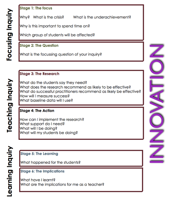
The topic of our conversation at the moment is "Teaching as Inquiry" and how we are applying this to our research this year.
Here is "Focusing Inquiry" :-
Stage 1 - The Focus
Why?
What is the crisis?
What is the underachievement?
Why is this important to spend time on?
Which group of students will be affected?
My focus is to improve the NCEA achievement of my Design and Visual Communication students.
My students are weak in the analysis skills of the course and this lets them down with the achievement of the standards.
This is important is as it is a skill that is across subject areas and it is these skills that are needed for the students to achieve at merit and excellence. The analysis of design work is key to understanding their own work and knowing how to improve upon it.
The group of students will be all of my Level 1 and Level 2 DVC students. I will also include any Year 10 students who want the opportunity to start some Level 1 credits.
Stage 2 - The Question
I plan to see how the use of online courses, in a MOOC style can affect student outcomes in these areas:

The topic of our conversation at the moment is "Teaching as Inquiry" and how we are applying this to our research this year.
Here is "Focusing Inquiry" :-
Stage 1 - The Focus
Why?
What is the crisis?
What is the underachievement?
Why is this important to spend time on?
Which group of students will be affected?
My focus is to improve the NCEA achievement of my Design and Visual Communication students.
My students are weak in the analysis skills of the course and this lets them down with the achievement of the standards.
This is important is as it is a skill that is across subject areas and it is these skills that are needed for the students to achieve at merit and excellence. The analysis of design work is key to understanding their own work and knowing how to improve upon it.
The group of students will be all of my Level 1 and Level 2 DVC students. I will also include any Year 10 students who want the opportunity to start some Level 1 credits.
Stage 2 - The Question
I plan to see how the use of online courses, in a MOOC style can affect student outcomes in these areas:
- Starting the DVC course early, in Year 10. This will get them an early start on Level 1 credits.
- Doing the online components in their own time at Level 1 and 2 and using more of the class time for group analysis work and skills practice, as it is these elements that will gain the higher levels of achievement for the students.
- Offering the courses to students who do not have space on their timetable due to other option choices.
Monday, January 19, 2015
My Thoughts on BYOD...
I have become increasingly worried over this holiday, as the back to school adverts start. There are lots of "your stop for BYOD" type things going on.
What is worrying me is that these devices are seen as the "thing" for school now, with no thought as to what is being bought and how it will be used in school. Do parents know when they are buying their BYOD device for the new school year, just how many other devices the teachers are having to cope with within their classroom?
I am coming at this from the standpoint of my own situation. We are a cluster of schools who are mostly working 1 to 1 with devices. Manaiakalani schools are lucky as we have lots of support from the Manaiakalani Education Trust which enables our parents to fund a device for our students over three years. We all have the same device in our classrooms and as I am one of the teachers who are helping other teachers with the PD for this, I am very grateful for this fact. I can focus my time on Google and online how to's and not have to worry about trying to help with lots of different devices in a classroom. I am a bit of a geek and am pretty confident in fiddling about with a bit of tech till I work it out, but I would not be confident in a classroom full of students with, potentially, a different device each. I want to be able to focus on the teaching tasks and learning using the online environment as a tool, not worrying about whether what I want to do will work on all the different devices the students are using.
Having to try and help staff with problems with all sorts of different devices sounds like a nightmare to me, and one that is loaded with so many negative possibilities that BYOD is setting itself up for bad press when the devices get used as paper substitutes by nervous staff. I know how much staff PD has gone into working the way that we are at the moment and wonder about the feasibility of an unending variation of devices that might turn up. How can we keep up?
Teachers need to be able to move into the 21st century style teaching environment with confidence in what they are trying to do, pedagogy wise. We need to focus on making sure we are using structures like the SAMR ladder in order to make sure we are making the most of the tools we are using. In my experience, this is more than enough to expect. I feel that this can not be happening when you don't know what to expect in terms of equipment.
If you are reading this and completely disagree with me then please leave a comment as I would love to have feedback from the other side of this.
What is worrying me is that these devices are seen as the "thing" for school now, with no thought as to what is being bought and how it will be used in school. Do parents know when they are buying their BYOD device for the new school year, just how many other devices the teachers are having to cope with within their classroom?
I am coming at this from the standpoint of my own situation. We are a cluster of schools who are mostly working 1 to 1 with devices. Manaiakalani schools are lucky as we have lots of support from the Manaiakalani Education Trust which enables our parents to fund a device for our students over three years. We all have the same device in our classrooms and as I am one of the teachers who are helping other teachers with the PD for this, I am very grateful for this fact. I can focus my time on Google and online how to's and not have to worry about trying to help with lots of different devices in a classroom. I am a bit of a geek and am pretty confident in fiddling about with a bit of tech till I work it out, but I would not be confident in a classroom full of students with, potentially, a different device each. I want to be able to focus on the teaching tasks and learning using the online environment as a tool, not worrying about whether what I want to do will work on all the different devices the students are using.
Having to try and help staff with problems with all sorts of different devices sounds like a nightmare to me, and one that is loaded with so many negative possibilities that BYOD is setting itself up for bad press when the devices get used as paper substitutes by nervous staff. I know how much staff PD has gone into working the way that we are at the moment and wonder about the feasibility of an unending variation of devices that might turn up. How can we keep up?
Teachers need to be able to move into the 21st century style teaching environment with confidence in what they are trying to do, pedagogy wise. We need to focus on making sure we are using structures like the SAMR ladder in order to make sure we are making the most of the tools we are using. In my experience, this is more than enough to expect. I feel that this can not be happening when you don't know what to expect in terms of equipment.
If you are reading this and completely disagree with me then please leave a comment as I would love to have feedback from the other side of this.
Thursday, January 15, 2015
Class Size and Online Courses....
Here is an interesting read about class sizes of online courses...
Link Here
Personally, when I tried an online course myself, which inspired me to go that direction for my students, the part I found intimidating was the forum. There were hundreds of people doing the same course and the forum was no longer a helpful place, but rather a sounding box for what you "knew" about the topic.
Link Here
Personally, when I tried an online course myself, which inspired me to go that direction for my students, the part I found intimidating was the forum. There were hundreds of people doing the same course and the forum was no longer a helpful place, but rather a sounding box for what you "knew" about the topic.
Thursday, December 4, 2014
Crowd Source Research
I have made a start on the planning of my Level 1 and 2 courses for next year, where they are set up MOOC style, with all the steps there for the students to work on in their own time.
Link here ( note.... not complete !!! )
Part of this thinking has been to see what other difference I can make to how I had my DVC site laid out for the students before.
I had everything all together in one place, the instructions, the resources, the examples, everything.
This proved to be a little confusing with the content being too much to search through.
Link to the old site here
My plan for this year is using a blog for the research, content, information etc and keeping the "mooc" site for the step by step instructions to keep it clean for the students to understand.
Link to the blog here
Link here ( note.... not complete !!! )
Part of this thinking has been to see what other difference I can make to how I had my DVC site laid out for the students before.
I had everything all together in one place, the instructions, the resources, the examples, everything.
This proved to be a little confusing with the content being too much to search through.
Link to the old site here
My plan for this year is using a blog for the research, content, information etc and keeping the "mooc" site for the step by step instructions to keep it clean for the students to understand.
Link to the blog here
The first part of this blog idea is that the students can search here first fro information about their project.
There will be information, videos, extra links to find out more etc.. This will be the launch pad for the rest of their research on a certain topic.
The other part of this blog idea is the tab along the top labelled "Team Talk". This is a page on the blog with a comment section a the bottom where they can write.
I want this to be the area where the students can add interesting bits of research that they find while doing their projects.
These can then be added to the main blog for everyone else to access and use.
It will eventually become a "crowd sourced" research area.
I decided to do this idea as a blog rather than use the Google Plus community for this too, as it is easier to set up the labels and search functions on a blog, as their will eventually be a lot of labels and this may become unmanageable in a community.
I have embedded and linked this blog on the class site so the students have easy access to it.
Friday, November 28, 2014
Having a First Play with Thing Link
We were having a go with Thing Link today to make our MIT14 page look more interesting...
Here is mine... it is my first play with Thing Link
MIT 14 Final Presentation
Today we had our final session for MIT 14 at the wonderful Spark building.
We all completed our final presentations, summing up our projects for the year.
Here is mine....
We all completed our final presentations, summing up our projects for the year.
Here is mine....
Subscribe to:
Posts (Atom)


.png)


.png)
.png)
.png)

.png)