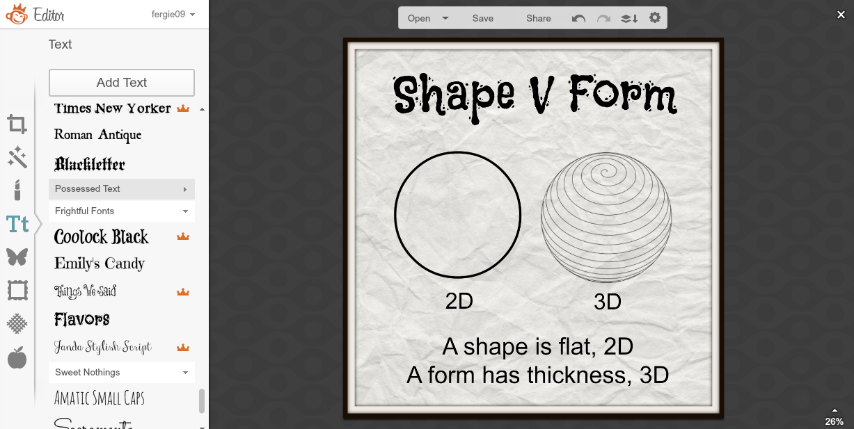
So I had a plan to try and use PicMonkey to design the pages of a book. I started out small and I am making pages about design terms, then I can use it with all of my classes.
Adding textured backgrounds, my own images in overlays, choice of fonts ... I am really enjoying this. I decided on a square format for my book, as this is less formal than a rectangular set up. The design option on the top of the PicMonkey front page gives you plenty of options.
When I am happy with my pages, I am saving them as image files which I am then putting into Adobe Acrobat Pro to create a single PDF with the individual files.
An example of an online app that does this is linked here... Convert JPG to PDF.net
The next step was to get the book into a format that is viewable on a site. I have used Flipsnack before so I decided to try this out to see what my book looks like.
I haven't done many pages yet as I was too excited to see what it looked like. No patience!!
I am pleased with the result and am happy that it is so easy to do, so when I get students onto this, they can concentrate on the content, not a really complicated sequence of events.
So now I need to stop blogging about it and get on with finishing the book!!!!
Now what can I get my students to make???.....
Level 2 students could create a book about their Art Deco research instead of a slide show?
Level 1 students could create a book about their chosen architect rather than a poster?.. They could still use Adobe Illustrator skills to create the image layouts.
My year 10 students could do the layout planning for their children's books like this.
The good thing is that it is an online app, so available where ever the students are online, the students are all familiar with it so there is very little lead in to the production and they don't need me to be there "guiding" them all through it. They can make all their pages the then the book "production" is really quick and easy.
Lots to think about....


No comments:
Post a Comment