I have having a go recently with compare and contrast with my Year 10 group and my Year 12 students who are doing NCEA level 2.
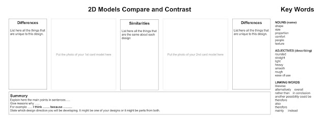
The Year 10 class are designing portable speakers. They are going to develop their designs on #Tinkercad so they can be 3D printed. So far they have sketched some ideas in 2D and I wanted them to compare their ideas. We drew out 2 chosen ideas on card, full size, and cut them out so they could be photographed held in the hand. They need to see the scale of their designs in relation to people. They then put these photographs on a compare and contrast chart. I thought that this would be an interesting way to analyse their design work and get them to think critically about the design decisions that htey have been making so far.
Here is the chart that I made for them on Google Drawing ... Link here to the original drawing.
My Year 12 group are working on AS91340 and are looking at Art Deco. As part of that, we compare Art Deco to Art Nouveau so they can see the changes and differences.
To make this easier for them, we make Google Drawings to compare the 2 styles and put our work in our class Google Plus Community so we can see each other's work and help as we go along.
Here is the chart that I made for them on Google Drawing .... Link here to the original drawing.
I like these charts as they are very visual and we can build the understanding and knowledge on the slowly, so they can see what they are doing and why.


No comments:
Post a Comment