Thursday, May 1, 2014

Be More Dog...

This week I have had a great time at the GAFE Summit NZ North Island.
The summit was a two day event this time round, so there was lots of choice of great things to go and listen to.

We kicked off with a keynote from Suan Yeo.
Here are my highlights from his keynote speech :-
  • A lot of the content on the net is repurposed and re-imaged - how can you make the content say what you want it to say.
  • Start with why.
  • Do schools kill creativity.
  • Children are born inquisitive.
  • Sometimes you win, sometimes you learn.
  • Shift from students as consumers to students as creators.
  • The sign up rate for MOOCS is HUGE.
  • MOOC like reading the newspaper.
  • You pick what you want to learn when you want to learn it.
  • Ask questions that can’t be Googled..
  • Flip the teacher - get the students to lead the class for the day.
  • Plan for the last mile not the first
  • Let technology do the hard work.
  • Computational thinking - problem solving - the steps are important not so much the answer.
  • Internet Explorer - the best browser for downloading a better browser ( !!! )
Then the sessions started and it was all on, finding the rooms and settling down to 8 sessions of Googly learning.

Here are my highlights of the two days :-
The sessions were hands on / having a go so my notes are short and bullet point style.

Playlists - Curating YouTube with Jim Sill

This was a great, useful session where I learned lots of really good stuff that I can apply and share.


  • You need an account for a playlist on YouTube.
  • When you subscribe to stuff it teaches google what to recommend.
  • You can click on these to stop them being shown - the three dots - but you can't get rid of recommended ones so use your personal account for the silly stuff, then it won’t show up on your work account for google to recommend from it.
  • Deleting the search history will delete all the things that guide the recommendations too.


Watch on full screen - you loose all the controls.
Large player - pushes all the other on screen stuff out of view - you can still use all the controls.

Safety Mode :-
  • Down the bottom - it says safety mode - gets rid of comments from the screen.
  • Limits recommended videos to a certain type of rating. - links to what you are watching.
  • You can push safety mode out to all chrome books on the control panel.
  • for example - Sesame street video - all the recommendations are of the same TV rating of the show you are watching.


Subscription - you can set it up to email you when new ones are added - but the normal setting will just include it on your feed when you log in.

You can set the video up to play from a certain spot - this changes the url link to accommodate this setting.

Add to - playlist.
You can share playlists across users / sign ins
Add to playlist or start a new playlist.
  • Public - anyone can find it
  • Unlisted - need the link can’t be searched for
  • Private - is private


There is a button that says remove duplicates - useful
When you play one from a playlist - it will continue on and play the rest in a loop.
You can drag and drop the order that they are in.
The share option on the playlist shares the whole playlist, not just one of the videos.

Embed code - embeds the whole playlist.

It does not show recommended videos at the end , it automatically goes onto the next one then shows a curly arrow to refresh.

  • Click on enable privacy enhanced mode to embed the playlist on a site.

Hover over the vid in the playlist, for lots more options.
  • Can edit start and end times - trim up the front and back of video - doesn’t effect the vid on the web, just what appears in your playlist.
  • Can add notes / instructions
  • On the upload button you can record straight from the web cam.
  • You can record instructions in the playlist and mix it into required trimmed videos.


Get students to snip and edit up playlists to show their understanding of a topic.

  • Use the filter drop down to guide searching.
  • Use a comma and add playlist to a search - you will only get playlists on that topic.


How to Make your Google Site not look like a Google Site with Ken Shelton


The main starting points are :-

  • navigational structure
  • page layout
  • look and feel - colour, typeface etc..


Get to your content in no more than 2 clicks.
  • Why? get to important info quickly.
  • The more clicks the faster the user experience declines.


Web pages are set up in tables.
This creates a frame for the content - you usually don’t see this frame.

1200 px is a fairly good standard browser size for the width of your site.

Have the tabs as category titles so this makes it more obvious there are drop downs under them. People will then find it natural to go to the drop downs to use them.

  • Layout - Keep it simple, keep it clean.
  • Page layout based on the content.


What colour is your personality?
Colour - emotion, temperature, symbolise.

Create an account in colour lovers to save your colour schemes in.

Take photos of products that have colours that inspire… use photoshop or pixlr to get the hex codes and create a colour palette.

Serif / san serif
serif - print
san serif - web  as there is more space

Do not use Comic san!!!


Tab titles - use a serif font as there is less space


Google Art Project with Jim Sill

I didn't take many notes here at all as I was too busy playing, but these links are well worth a visit as the Google Art Project is AWESOME. The 1giga pixel photographs are AMAZING, you can get SO close to the paintings, you can see the canvas structure and individual brush strokes.
Being able to take tours and walks around galleries all round the world is an opportunity not to be missed. You can loose a LOT of time browsing though this project.


Collaboration - Concept, Power and Magic with Julie Lindsay


ISTE.org


You can’t expect students to collaborate if teachers don't model it

  • Synchronous - in real time
  • Asynchronous - out of time, the glue that holds collaboration together across all sorts of groups.


Cooperation + Contribution = Collaboration

  • Contribute is the one that sometimes gets lost in the mix
  • + co creation - what are you going to do together?


It is not always about you and your work, it is about the final thing that you are working on together.

voicethread.com

How are we supporting collaboration online?

Potential for miscommunication

  • Can you use tools other than google docs for collaborative learning, to build on the comfort level issues of working only through online methods - skype?, chat?, forum?


poll everywhere - free account takes first 40 answers


Google Docs - The Ultimate Workflow and Applications Suite with Ken Shelton


What can you do in 2 steps that used to take 7?
Have drive in grid view and colour the folders for instant recognition.
Thumbnails of files.

Autosave is every three to seven seconds

Develop an efficient naming protocol for documents.
Name, class, title - these become searchable terms.

Put a header on the doc and  use #name, class, title - this is then searchable too

Create searchable identifiers

My Session doc - contains lots of great pointers for using the research tool in Google docs.


I have learned LOADS of great stuff over the 2 days and the plan now is to start breaking it down and working out how I can use it and how I can share it with others.

Lots to do !!!

But, we all need to :-

BE MORE DOG!!

Embrace the experience!
Grab the frisbee!!


Thursday, April 17, 2014

The 10 Commandments of Typography

The 10 Commandments of Typography
A great graphic found on Visual.ly.
The original can be found here from DesignMantic.


The 10 Commandments of Typography


Wednesday, April 16, 2014

Analysing Design Applications

I took the second day today of the 8 Manaiakalani research days that I can have this year.
I decided to use it to try and assess and analyse some online design apps and I decided to get a small group of students to help me to do this.

I sent them all this document with a selection on online programmes and chrome apps for them to test and try out. They had to try and design something with these tools and see how easy they were to use.
Link to document

Between them they had Asus netbooks, Samsung chrome books, and we used PC desktops and Apple desktops.
They had to see if the apps we were looking at could be used on a variety of devices to make sure they were useable for lots of different situations.
Here is a link to the students' analysis sheets that they filled in as they went.

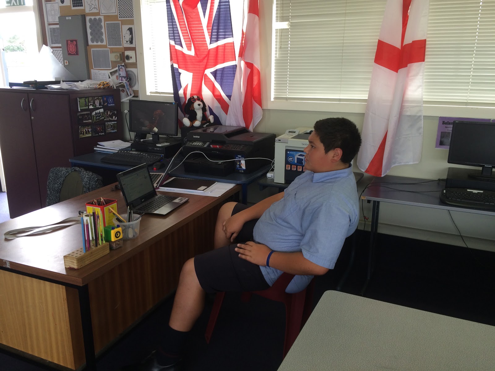
Here is Fiu, being comfortable on a beanbag set up on 3 chairs, testing out the same app on a desktop and a netbook.


In the afternoon, we decided to try out some iPad apps.
Here are the ones that were tested and tried out :-
Homestyle 3D

A big hit was the Tayasui sketches app as it was easy to draw with and very realistic looking when you are sketching.
Doodle Buddy was popular but maybe not detailed enough for the higher levels in design work.
Autodesk always provides good design tools and it is good to see them available in an iPad format.

Overall, a very productive day with some good outcomes and some disappointments. A key question came through. How can a really good app like 3D Design Something, which we all rated as really good and easy to use and is totally online, not work on the netbook? Frustrating.
The iPad app test has made me want to use the iPads in DVC so I need to go shopping for some stylus pens.


Mino and Jarna working hard
Nathaniel trialling apps and giving feedback

Pizza for lunch. Have to feed the troops...


Sunday, April 13, 2014

Quality Feedback to Aid Planning...

While designing the online course trial module, it was definitely a different planning experience. I tried hard to think of all possibilities so that I could make resources to cover every thing.
The trial module went live today and one of my students has made a start on it.
I have been getting some quality feedback from him already, via Google Plus, which has helped me to improve the experience for the others when they start.

Saia had uploaded his architect photos to a Google Plus album and I gave him some feedback that a wider range was needed and to make the album public, as he had shared it privately. I need all of this online work to be public so it can be moderated.

When Saia  acted on this feedback, I noticed that he had made a new folder rather than change the one that he had already made.


When he started his new folder, I asked if more help videos on the online task were needed.
So I made a couple more to cover  changing the sharing settings of an album you already have and how to add more photos to an album you have already started.
Saia has already been adding more photos to his album since so this is going to be helpful to the others in the test group when they get that far.
It is hard to think of everything that might crop up and it is really useful to have students who are willing to give it a go first and not be shy to give some helpful feedback.


It is good to see that he is using the tracking sheet system. It makes it really easy to see an overview of where he is up to at any given time.


Friday, April 11, 2014

Planning to be Not There......

I took the first of my 8 support days today and I focussed my time on planning the online Level 1 module.
It was a very productive day, with making screencasts and instruction sets for all the tasks that make up the project.
It is definitely a different thought process to plan a course where the students do not get me to show and tell them what to do in person. I have tried to break it down into the chunks that I think make it clear to understand and I will see how effective that is when my trial set of Year 10 students work their way through it. Nine members of my Year 10 tutor class have agreed to trial it for me when it is ready. The payoff for them is that they will get 4 Level 1 credits out of it while they are still in year 10.
I went into work today even though I was off timetable to do this as I knew that I would get more work done there than at home, but the tricky part was finding somewhere quiet enough to make my screencasts. I made the decision not to make each screen cast too long ( none of them are over 4 minutes), so if there was more to cover, I split that section up into two parts. I did this so the information is in bite size pieces that can be easily covered in a short time. The students are doing all of this in their own time, so I did not want to make each section in each task a long painful process that would put them off going back.
The key points from me doing a MOOC with Future Learn that I wanted to include are :-
  • Small chunks  of information in the form of video
  • Visual tracking of progress
  • Community / forum support

For the tracking, I have used a Google spreadsheet that the students will change the colour of each task as they go along. They will embed this on the front page of their Google site so it is the first thing that they see when they go back to their work.
I have set up a Google plus community for the forum support element that is needed in the online course, as I have used this with my classes already this year and it is proving very effective to support their writing.
Of the 10 tasks in the project, I have completed 7 of them so far and I really need to finish the others over the weekend as I want the students to have access to this next week so they can make a start over the 2 week holiday if they want to.

I am really looking forward to them making a start and seeing how it goes.
I have warned them that I will be sending them regular Google forms to get feedback from them about how they are finding the process.


Update - Sunday 13th April
I completed the tasks today, I have had it checked over by a couple of fresh pairs of eyes and I have sent the link to my 9 guinea pigs.
I have to be patient now.

A bit later on Sunday....

I have a had a bite. I have been getting excited watching one of my students enrol, start his folders and site and share things with me, then watch him make his site ready to go, use his tracking sheet and decide which architect he is going to research. 
I need to stop stalking.


Sunday, April 6, 2014

My Own Learning and Planning by Doing......

When I plan a project for DVC, I have always  drawn and made all the things that I am expecting the students to do. This serves multiple purposes for me. It helps me see the steps that need to be taken to complete the process, it lets me see where the bumps in the road might be, it helps me plan materials and equipment needs at different steps in the process and it gives me examples to show the students at the start of the project. I find that it always helps the students to see me actually do the tasks in front of them too. It lets them see the skills and processes in action, and it lets them see that I can do it and not just talk about it.
As an aside, I tend to do my drawings etc, in the staff room where I can join in chat while I work rather than sit by myself in my own classroom (I really don't like quiet while I work). I am always surprised by the number of staff members who walk past what I am doing and say things like "it must be nice to have the time to sit and do things like that". Seriously! So are they telling me that they do no planning and examples for their students? A colleague who knows of my frustration about this happening has taken to walking past and saying "colouring in again?" just to wind me up !! Anyway, back on to the topic....
With my research into blended learning, I have decided to follow the same process that helps me to understand what the students have to do and actually try it myself.
I have signed up for Future Learn. This is a MOOC mostly owned by the Open University, but they are partnered by a large list of Universities. Link here to Wikipedia with a brief explanation.
Here is an article in the Guardian about how this is changing the way people learn.
It was really easy to sign up for, an email and a password to set it up was all that was needed and I was in browsing their courses.
I have signed up for one called "The Mind is Flat" from the University of Warwick. It is a 6 week course and I am starting late as they have already been going for nearly two weeks. I didn't mind this as I thought it would give me a good insight into starting late, working at my own pace, catching up etc.

The Process

I signed up yesterday and I am in the process of working through the work from week 1.
When you log in, you see a screen that lists the courses you are signed up to.
I only have one here are this is all I am signed up for at the moment. It gives you a coloured graphic of where the course is up to and where you are up to on it (the blue parts are the bits I have done so far).


When you click onto your course, it is broken down into steps that you work through in each week. You can click back into weeks to look at what you have already gone through and to catch up, and you can click forward to see what is coming up in later weeks. As you work though each step, the colour changes from pink to blue so you can visually see where you are up to in the steps. These steps are a mix of discussions, articles and videos.


The videos that I have been watching so far are clear to hear and understand, with the lecturer talking to you against a plain background so there is no distractions. It lets you know how long the videos are before you play them so you can plan your time accordingly. Underneath the video is a download link so you can get a pdf of a transcript of what was said in the video. There is also an area to add comments as you are encouraged to discuss what you have seen in the video. To be honest, I found this quite intimidating as there was over 500 comments on some of the videos and as usual on the internet, it becomes an excuse for some people to show off about what they have read, disagree with the video that they have seen and generally be on their own box.
Once you are happy that you have completed a section, you click the pink "mark as complete" button and this then changes your progress colour to blue so you can see where you are up to when you log in next.


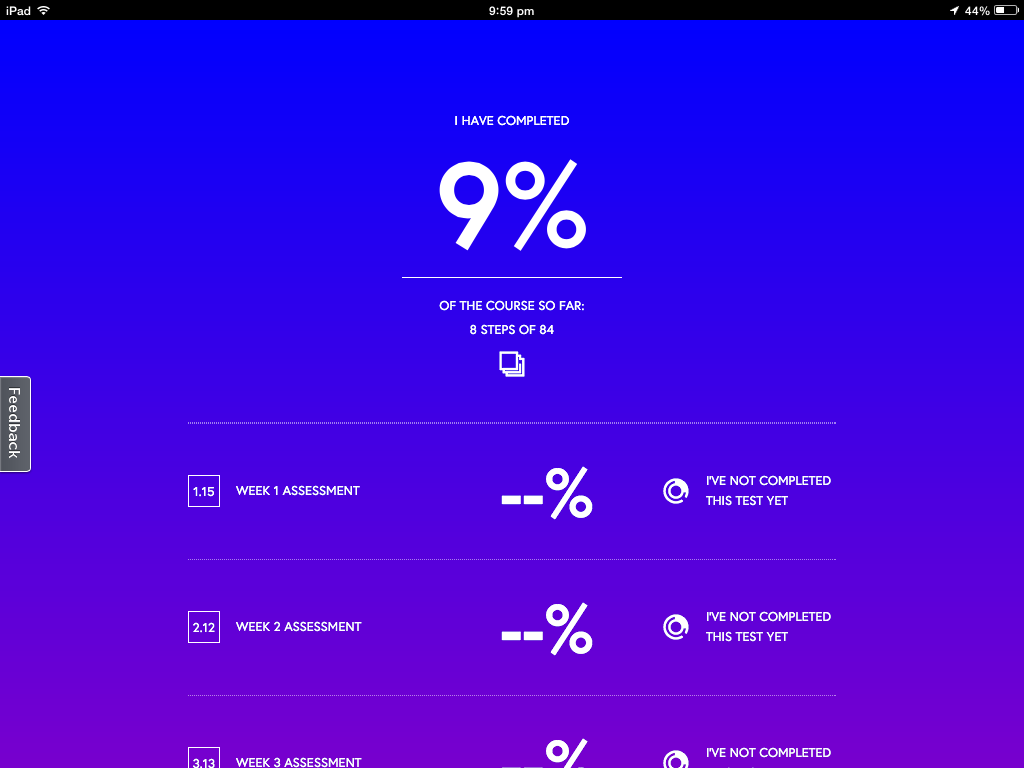
You can keep a check on your progress on this screen, where it tells you how much you have completed and any marks for tests that you have done. 
I have been going through all the steps on my iPad up to now, but you can do them on any device as you just have to log into the site on a browser. 


So what can I take away from this?
  • Progress on the course being visual and easy to keep up with.
  • Each week being broken down into small steps.
  • The videos are clear and easy to understand.
  • The videos are not too long each time so are easier to take in the whole thing.
  • The timing of the videos being stated before you click play so you know how much time to give them.
  • The transcripts of the videos being available to read afterwards. This is good with different accents, understanding etc might make videos alone not very accessible.
  • The chat / discussion / forum area of each section is a good idea but for younger students this needs to be more structured than just an open area. A particular focus for discussion needs to be put in place but I like the idea of the students on the course helping each other.
I have not got to the part where there are activities and tests yet.

Questions...

With the timetabling constraints within a secondary school, there are always students who would like to take my course but the timetable clashes with another subject.
Would I be able to set up an entirely online course for these students?
I feel that I would have to meet with them still to give face to face support on things they were unsure about, and it would have to be after school. How often would be enough to support an online course?
Would this give students the opportunity to gain more credits without it taking time and options off them during the school day? 
Would I be able to explain and support the skills needed in DVC enough for the students to produce work of a suitable standard?
How would students submit drawn work? 
Would the online students have to come in to the DVC room to use equipment? When would this happen?

I am fascinated by all these questions and I think my next step next week is to talk to particular students who I know did not take my course again this year due to timetable constraints, and see what they think.


Friday, April 4, 2014

Design Words

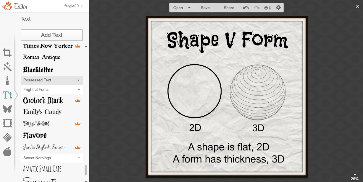
My students have to use the correct design language when they are talking about, and analysing their work. They have to know about the main design principles and elements that they have used. It is always the weakest point of the process, so I have made a collection of the words we need to use the most and tried to illustrate them and explain them as simply as I can.
Maybe in between projects, or as a break mid way through a longer project, they could make their own design words pages with their own definitions on them. I have made these on PicMonkey, and the students all know how to use that programme. I have to be able to get them to start using these words in a more natural and less forced way, then when they get to the notes and analysis part of their work, it flows more than it does at the moment. Maybe they could have a ongoing slide show of their own embedded into their DVC portfolio sites and keep adding to it as they learn more words and meanings.

Tuesday, April 1, 2014

I'm a Monkey Lover I am !!!

I am becoming an increasingly bigger and bigger fan of Pic Monkey. I subscribe to their emails, blog and follow them on Google Plus. The blog is an endless source of tips and tricks, and yes I know it is trying to sell me something too, but the graphic design information, tutorials and tips are great.
So I had a plan to try and use PicMonkey to design the pages of a book. I started out small and I am making pages about design terms, then I can use it with all of my classes.


Adding textured backgrounds, my own images in overlays, choice of fonts ... I am really enjoying this. I decided on a square format for my book, as this is less formal than a rectangular set up. The design option on the top of the PicMonkey front page gives you plenty of options.


When I am happy with my pages, I am saving them as image files which I am then putting into Adobe Acrobat Pro to create a single PDF with the individual files.
An example of an online app that does this is linked here... Convert JPG to PDF.net


The next step was to get the book into a format that is viewable on a site. I have used Flipsnack before so I decided to try this out to see what my book looks like.
I haven't done many pages yet as I was too excited to see what it looked like. No patience!!
I am pleased with the result and am happy that it is so easy to do, so when I get students onto this, they can concentrate on the content, not a really complicated sequence of events.


So now I need to stop blogging about it and get on with finishing the book!!!!
Now what can I get my students to make???.....
Level 2 students could create a book about their Art Deco research instead of a slide show?
Level 1 students could create a book about their chosen architect rather than a poster?.. They could still use Adobe Illustrator skills to create the image layouts.
My year 10 students could do the layout planning for their children's books like this.
The good thing is that it is an online app, so available where ever the students are online, the students are all familiar with it so there is very little lead in to the production and they don't need me to be there "guiding" them all through it. They can make all their pages the then the book "production" is really quick and easy.
Lots to think about....

Friday, March 28, 2014

Classroom Discussions

After listening to Mr John Hattie at the Festival of Education last weekend in Auckland, there were a lot of things that I picked up on about my own practice.
One of those things was this statistic :  "65% of teachers do not do classroom discussions" and this stuck with me as I am guilty of not doing this very often at all. This was one of the things that Mr Hattie listed as making a measurable impact to student progress in the classroom.


This week I thought that I would give this activity some conscious effort and decided to start with my Level 1 group. On Monday, I got them all round the front of the class and we looked at a selection of movie posters that I have collected together into a Google Plus album.
They had to tell me about the following things :-
  • What is the focus of attention?
  • How has this element been made the focus of attention?
  • How does your eye flow across the design?
  • How has colour been used to good effect in the design?
  • What style of lettering has been used and why?
Here are the posters that we looked at in this session.
Posters

To start with, they were a bit shy and I had to prod them individually to get them started.
Then it swung the other way, where they were talking over the top of each other and not listening too hard to what each other was saying. It was an ok start though, at least they weren't refusing to talk at all and they had an opinion we could discuss and compare.
Today ( Friday ), we gave it another try, and we sat round the front to discuss their own work as a whole group. They have done their design developments and are at the stage where they have to make decisions about what they are keeping and what they are not going to use for the final design. I thought it might be fun to do this as a class discussion, so they could listen to other people's opinions about their work.
They did this really well today and gave some quality feedback to each other. They gave feedback on the layout, the choice of pictures, the font and position of the main tittle and anything else that they thought was relevant to bring up.

Here are their design developments that we looked at today.

Level 1 Poster Design Development 2014

I am feeling the benefit of these discussions already, even though we are only 2 in to the process. It is giving me chance to listen to the students verbalise what they have been learning and get to know them a little more. It is good to see them have the confidence to discuss each other's work and give feedback that is useful to the others in the class.
I will definitely be doing more of this.

Thursday, March 27, 2014

MIT14 ~ Where are we up to ?

This presentation describes briefly where the project is up to at the moment, 8 weeks in.
It has links out to Google Plus Communities that the students post in, the class site that they work from and links to student work. It ends with a Year 11 student talking about how he produces his work in DVC this year.
If you want to know more about the project, click the link on the last slide.


Here is the video from the end of the slide show...


Tuesday, March 25, 2014

Green Screening on iMovie 10

We have begun to organise ourselves for our next big budget TCTV production... ( ok, no budget is more like it ... )
One of the things that we need to do is some green screen action, so we decided to have a little trial go today. We had a try last year when we made the opening titles for our Doctor Who presentation for the Manaiakalani Film Festival.
All we had to do last time was to drop one clip on top of the other and a nice handy dandy little menu would pop up with useful things you could do, like green screen. This was on iMovie 9 and since then, I have got a new mac book and am using iMovie 10, but I haven't tried to use green screen yet.
I taped some green sugar paper to my board, cut out a print out of the Millennium Falcon and put it on a piece of rolled up green paper and we had a go. I was flying the Falcon while Dj manned the iPhone doing the recording.
A nice shot of a suitable space background was dropped into iMovie and then we tried to drag the Falcon footage on top of it. A very small list of options came up, but no juicy ones like side by side, or screen in screen, or green screen. Frustrating.

After much muttering and grumbling, I found this really useful video on YouTube.
Thank you Mr Mitch Davis - link to his YouTube channel here.


It basically boils down to placing the background footage on the timeline, with the green screened footage above it.


Once you have done that, then a new option appears on the adjust bar at the top. It is the one on the left. You can then choose this option and a drop down appears where you can choose from the more interesting options for editing, like green screen.


Here is our trial today. It is not very long but I am very happy with the outcome. It is definitely something we can do, I have learned something today and we have had a chat about how ere are going to improve it for the real filming.


Apple, you know I normally love you ( except for the standard apple mouse, but that is a whole other conversation ), but this was not the smoothest upgrade transition of a task that was once so easy. It took some shuffling about to find out how to do this today. hhmm.....

Thursday, March 20, 2014

Level 1 Feedback about using Google Plus Communities

I recorded my Level 1 students today, talking about what they thought about using the Google Plus Community within the group.

So far we have been using it for practice activities and to upload development work to receive class feedback. They are just about to start using this feedback to write the analysis notes of their own design developments.

Fiu


Josh and Fiu


Joseph and Aidan


Moana


It is good to hear from them that they are OK using the community and are not shy about sharing their work with each other.
What is interesting to hear is that they find it easier to give feedback on other's work than on their own.
"It is difficult for them to see their own mistakes"

What was good to hear from one of the students, was about his lack of understanding of what he was doing. He is one of the lower aSStle scores from last year in Year 10. He was nervous after the recording that I might be angry with him for saying that, but if that is how he is feeling then that is what I need to know! It is no good just saying what he thought I wanted to hear. I am so happy he was honest with me.
What I need to do is structure how to use the feedback to create bullet points of analysis for their own work. I have started a document of sentence starters, on a Google Document, but I am thinking now that I will produce these on cards that the students can have in front of them as they are analysing their work. The Google doc method could still be used if I structured the starters / questions / layout of it so that the students filled this in with the feedback that was put on their work.
After talking with the HOD English, structured sentence starters is the way to go with this.

On a practical note, this was really easy to do. I used the audio recording facility on my iPhone. I then emailed the files to myself. Logging into SoundCloud was really easy, I just clicked the log in with Google button to start the account. What is slightly disconcerting is, because I logged in with my Google account, it took the icon that I have on Google, so my weemee is HUGE on the screen for each recording when it is embedded. I have changed the embed option coming from SoundCloud on the first 3 of them and left the last one as the bigger embed to see the difference. I much prefer the smaller embedded player.

This was a very useful exercise with the students today and it has certainly got me thinking a LOT.

Tuesday, March 18, 2014

Add Ons for Google Docs

There has been a big thing on the net at the moment about the new add ons for Google Documents, so
I had to give some of them a go to see if I could use them within my DVC lessons.

Check out this Google video on how to install the add ons.


The first one I looked at was Twitter Curator.
This allows you to type in a search term or hash tag and it will search twitter for tweets about that for you. You can then browse them in the side bar and choose the ones you want to insert on your document. I like this choosing feature, as it means you don't have a document full of things you really don't want or are irrelevant.
I am looking forward to using this next month at the Gafe Summit in Auckland.
The document I used to try this out and analyse it as I did so is here...

The second one that I looked at today was TextHelp Study Skills.
This allows you to highlight text that you are reading through in different colours. If you choose your colours based on categories that you want to be grouped together, then the really good bit is that it will then group those coloured sections together in another document. This will save copying and pasting or retyping.
I am going to try this out with my Level 1 DVC class quite soon as they need to analyse collected texts about their chosen architect, so this will be a useful tool.
What I don't like about it is that it won't continue the same collection if you stop and go back to it later.
Hmm...something for them to work on.
Link to the documents here.


Monday, March 17, 2014

Playing with Screencasting using Snagit on my new Chromebook

I got my new Chromebook today. It is an Acer C720, the new model that the students are getting this year.
I am loving it already. Easy, fast, light weight.
One of the first things I had to try out was screen casting using the Snagit app from the Chrome web store.
I had seen it mentioned on Google Plus, so had to give it a try.

In the Chrome web store, there are two entries for Snagit, an app and and extension. You need to get both of them.


After you have got both of these, open the app and click on the settings wheel. You need to tick the "enable experimental features" option. Once you have done this, the input audio levels bar will be seen and if you make a noise, you will see this pick up the sound.


Now when you open the Snagit app, you will see this box. This will hold all of your screen captures and it has the button to start a new screen cast.


The first time that you do this, it will display a warning box that you need to enable a setting in chrome. It has a link to this so click on through to it. It will take you straight to the settings that need the enable option clicking.
Restart chrome and you are ready to go.
When you click on new screen recording now, it asks to share you screen, so choose yes.
You can then do everything on your screen that you want to record.


This box is down at the bottom left of your screen, and when you are doe, you click on stop.


When you have finished, it will display this box where you can review your recording and see if it is good enough. If you don't like it, just hit the cross to close it and you can start again.
You can also choose a file name here, at the top where the date and time is as a placeholder name.


At the bottom, there is a share option and you get to choose from your Google drive or YouTube account.


Here is a quick one that I made to try it out. This is hosted on YouTube.


Here is a link to a site page where I embedded the video that I had saved into my Google Drive.

On the whole, I found this easy to do and the quality of the output was really good.
I have not tried this on any other device yet, so I don't know if the quality is different then, but I am pleased with the result today.
Very useful......

Tuesday, March 4, 2014

Sharing the Love ~ Junior Assessment

On my project pages for the junior students on my class Google site, I needed some way to link the assessment scheme for Technology to the tasks that the students were doing within the projects.
On the layout of this page, I had set it up with a left sidebar so that the assessment could be put in there to line up with the tasks. That left sidebar has sat there blank for a few weeks while I come up with a way to do tis that is not just a load of words that will confuse the students away from the project steps.

Today, I decided to make a series of buttons using Adobe illustrator, that will link the students to the assessment schedules that match with the task they have been asked to do.

I has already embedded the folder with the assessment schedules in it on the front page of the juniors section, so these documents were already open and available to the students, but they were not really going to that page unless told to, so I wanted this information more "in their face".
Link to this junior page here.
A How To on how to embed a folder from your Google drive onto your site here.


I made the buttons nice bright colours so the students could see them easily on the project page, but they are not the main focus. I left the design as simple initials of the assessments, using different colours for the different schedules so they could easily see the differences in assessment for each section.
These buttons are hyperlinked to the document outlining the assessment schedule for each one, so if a student wants to see what they are being assessed on for each task, it is there next to the instructions to be clicked on. They can see what they have to do to reach each curriculum level and what level they are working at.

Link to the Pop Up Book project page here, to see the plan in place.